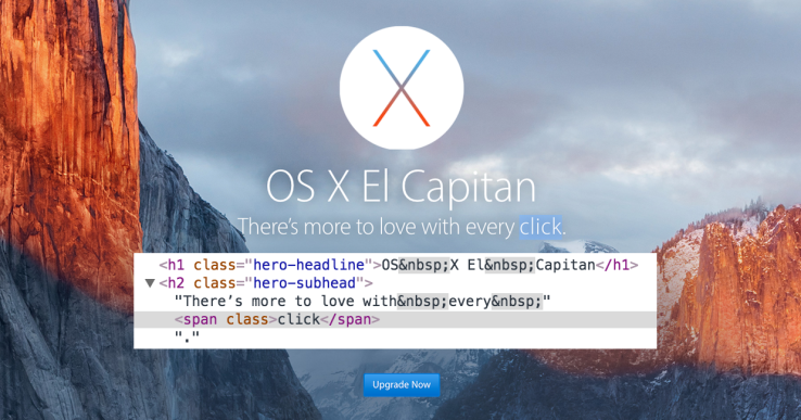
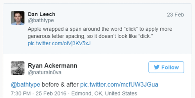
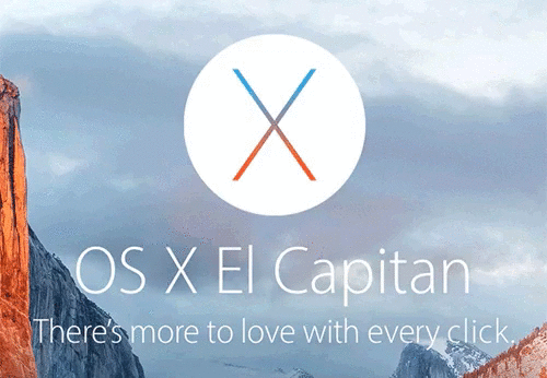
If you squint, you can see how the word “click” might look inappropriate. But Apple’s too prim and proper for that. So when it wanted the tagline for its new desktop operating system El Capitan to be “There’s more to love with every click”, it made a tiny, hilarious tweak to its website’s CSS code.
By adding a little extra spacing between each letter in the word “click”, it’s a lot less likely to be mistaken for “dick”. Otherwise, “Upgrade Now” would have taken on a whole different meaning. Sometimes the only thing standing between your brand and a ‘dick’ is a little keming.
By adding a little extra spacing between each letter in the word “click”, it’s a lot less likely to be mistaken for “dick”. Otherwise, “Upgrade Now” would have taken on a whole different meaning. Sometimes the only thing standing between your brand and a ‘dick’ is a little keming.
Writer - Liam McClelland | @Liamicy